Exploring the features of Enjoyment work
Table of Contents:
Introduction
Essentiality is the heart of any good software, and this theme is designed to ensure that I don't add things that I won't use on a daily basis or not have things that would be important for my personal usecase. It has been designed carefully to get rid of all the feature creeps, bloatwares, etc. i.e., no bootstrap, no semantic, no jquery, no nothing…
That said, this is a ready made theme and I am making it public so that more number of people will use it and enjoy the experience of using it. So, pardon my bigotry there😅.
As for the list of features, this website steals features from every website that I can think of, or more appropriately the design inspiration for this website is derived from multiple sources; Here is the tiny list for the curious:
- Backlinks: Roam Research
- Transclusion: Tiddlywiki
- Sidenote: Edward Tufte, Gwern Branwen
- Stale Link Highlighting: Tiddlywiki
- Wiki-style links: Every wiki ever
- Text highlighting: Roam Research
- Page preview: Wikipedia
- Context menu: Google Docs
- Notes: Andy Matuschak's Evergreen Notes
- Color scheme: Github
- Feed like structure for home page: Twitter
- Omnisearch box at the top: Google
- Profile board: Twitter/Instagram
Now that you know all my secrets let us not waste any more time into further exposing my true nature in its entirety and get started with tour:P
Note: This page only showcases the features. How to use these feature is mentioned in a separate article.
Backlinks
Backlinks or as Roam Research calls it "Birdirectional Links" is a nifty little feature that allows not only users reading your essays/articles to encounter interesting related articles, this is something you as a author yourself will see how powerful it is once you start browsing around your website. Backlinks are basically a link on PostA indicating all the mentions of PostA on different Posts.
The neat stuff is it won't show up with an empty box if a given post doesn't have any backlinks and if it is already included in backlinks, it won't show up in your related postsRelated Posts: Posts that share same tag(s).
Linked References(Backlinks): Posts that link other posts inside your blog.. :)
Here is a screenshot of what mentions/backlinks will look like in a page:
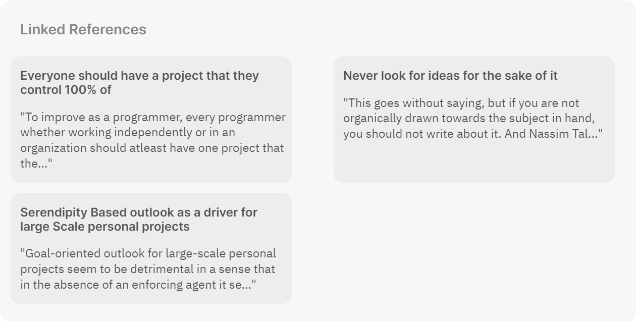
In the above example, it can be seen that there are three links, it means that all the three pages have a link to the page in which they are being displayed as a backlink.
For eg. If you scroll all the way to the bottom, you will something similar i.e., you will see a link to the pages that has a link to this page.
Sidenotes and Marginnotes
Of what use are such wide margins when you can't make efficient use of them. Fear not, we have a way to handle that too — MarginnotesThere are two types of people, those who have taste and those who don't. And anyone who has even a tiny bit of taste will never, never-ever use footnotes over sidenotes.
—Some random blogger who shall remain unamed. For what it's worth, when you stroll down a garden, you don't ever see a flower bloom 10 miles away from the plant do you? This is where sidenotes come in and replace their paper-era sibling ie., footnotes. If it is relevant you see it right there. (No scrolling = No cognitive strain). The entire idea is to allow users to have a pleasant time on your blog i.e., Not too distracting(offputting), not too mesmerizing, just the right amount of ornamentation to allow seamless reading experienceI see it as an issue of managing & exposing the length. Some readers want to go as deep as you can take them, but others are frustrated if you block them from moving on. I deal with it by use of collapsible sections+abstracts, margin notes, and explicit topics in list items.
—Tweet by Gwern Branwen. The added advantage we have with this website is it has wide margins allowing us to use both sides for sidenotes. So we can use them for quotations, small snippets, and also for interactive/expository animations.
The first one on the right is a marginnote and the second one on the left is a sidenote. You may ask what is the difference, it looks all the same to me. You are right to some extent, but if you look closely you will see that the one on left has a number attached to it while the one on the right doesn't. Yes, that is all the difference there is, at least Edward Tufte says.
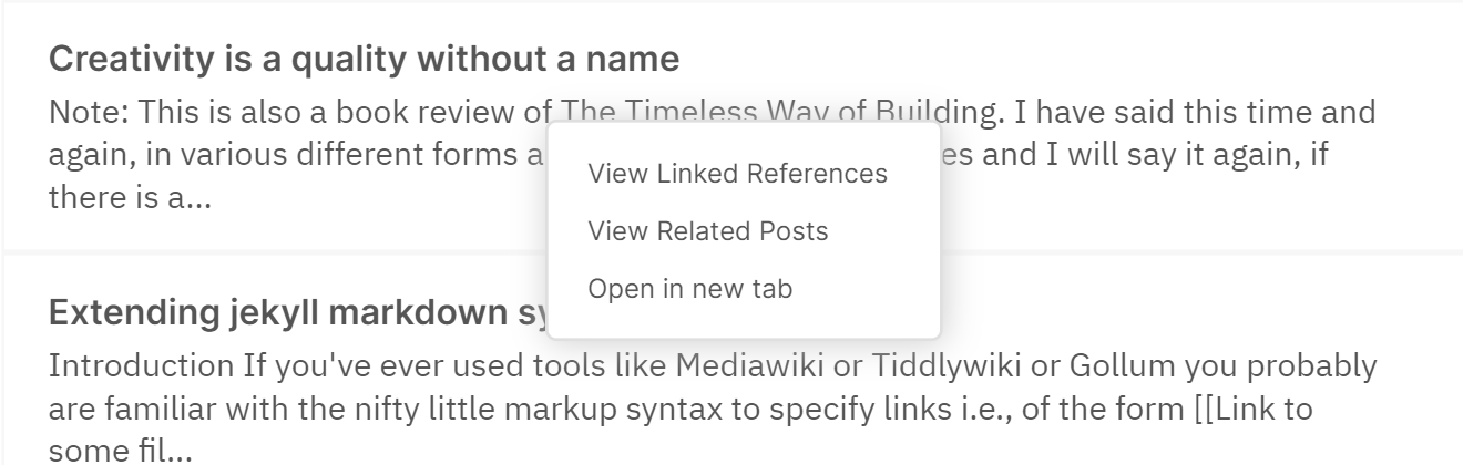
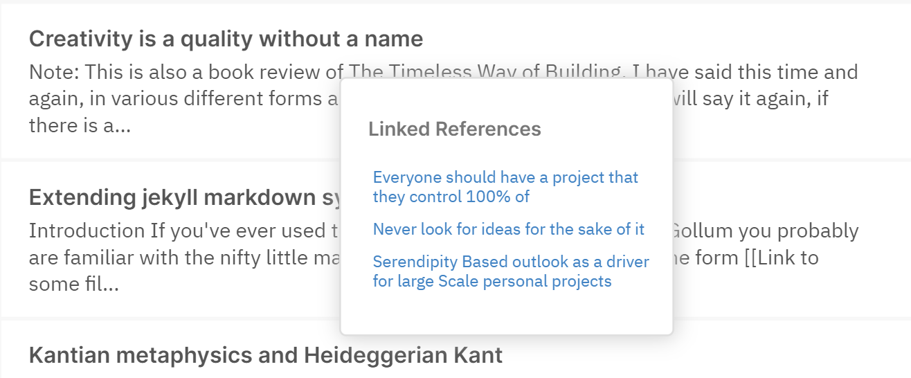
On-feed context menu
Context menus are a great way to improve user experience if they are done correctly. Given that our theme has a feed-link structure for the landing page, it leverages the opportunity and saves second time visitors who have already read the article and are only here to see other related articles or the backlinks by just simply right clicking on the feed. Thereby saving users the unnecessay time involved with clicking on a link and scrolling all the way down to see the backlinks or related articles.
Here is a screenshot for people who are too lazy, while the rest of you can go back to the home page and try it out by right clicking on a particular feed entry:
On-hover page preview
Ever been to a blog or a tutorial site and seen links to other pages without any clue as to what that page is about apart from vague statements like "See Related" or "Click here for Part II". We all have had that experience, haven't we? Wouldn't it be nice to be able to take a cursory glance at the page just so that you could get a feel of it and decide quickly as to whether or not do you really want to read that post without having to click on the link and wait for the ginormous scroll of text to load? That is precisely what page previews are for. For eg, try to hover over this link: Serendipity Based outlook as a driver for large Scale personal projects.
And yes, all of what you see is available right out of the box. No configuration, no sh*t, no shinola.
Transclusion
Once I had sidenotes and page preview for my blog, transclusion Transclusion
Serendipity Based outlook as a driver for large Scale personal projects
just felt like the natural next step to it. I mean there are less important pages that you can leave at the discretion of the readers to hover-over and take a peak, and then there are pages that you want to explicity show a glimpse of, but how do you do it? Obviously, putting a chunk of random text in the most of your post is just unacceptable UX, but then how else do you do it? You could just combine the nifty little preview thingy with your nice little sidenote thingy and let users get a glimpse of the important stuff without getting distracted. Amazing, isn't it?
Link Management
Now the biggest of them all: the permalink curse. Most of us are never happy with the first title that we come up with, and when you excitingly write a new post embedding an old post—the title of which you always wanted to change but never got time to do so because you were busy creating content—it sometimes happens that you forget to update the relevant link all the associated places that you linked it in. And I think this is worst of them all in terms of an UX nightmare.
Although we don't have a complete solution given that we are using a static site generator, I think we have a decent mechanism to atleast find the culprit links without clicking at them (a.k.a highlighting links that don't point anywhere, but ideally must be pointing to some location due to which they cannot be deleted).
Here is an example of:
- A perfectly valid link: Comparison based on accomplishment does not have a baseline
- A bad link that does not point anywhere: Some non-existing title
See how it highlights in yellow? I feel this is a game-changer that anyone who has a personal website should at least think of incorporating in their website given the number of deadlink issues we face.
Note: This only works with local/internal links.
Miscellaneous Features: Highlighting text, Primitive Flash Cards, and Some gimmicks
Text Highlighting
So you are writing an essay and you want to emphasize a particular portion of your essay to your audience that you think is just mindblowing. Tools like Medium provide such an easy way to do this while we still keep scratching our head with mark tags and p tag with a background color and what not.. Worry not, this theme allows you to easily highlight a portion of a text without any hassle.
Here is an example of it:
"Lorem ipsum dolor sit amet, consectetur adipiscing elit, sed do eiusmod tempor incididunt ut labore et dolore magna aliqua. Ut enim ad minim veniam, quis nostrud exercitation ullamco laboris nisi ut aliquip ex ea commodo consequat. Duis aute irure dolor in reprehenderit in voluptate velit esse cillum dolore eu fugiat nulla pariatur. Excepteur sint occaecat cupidatat non proident, sunt in culpa qui officia deserunt mollit anim id est laborum."
Primitive Flashcards
Anki has been my friend, my well-wisher, my guardian, pretty much everything for the last one year of my intellectual life. I have a half-hour morning routine that I follow dilligently in going through the scheduled anki decks to strengthen my neuronal connection on a particular topic/subject. And I have been doing it consistently for almost a year now. This is an attempt at recreating the aspect of spaced-repetition to allow my brain to form interesting connections based on things I have already written. The plan is to extend it using local storage and somekind of firebase like service to provide a constant reminder to users using the supermemo algorithm, but as of now, this is where I stand — a simple on-click card to keep the thing going until I build something better.
Here is an example(click on the card):
"Lorem ipsum dolor sit amet, Flashcard
consectetur adipiscing elit, sed do eiusmod tempor incididunt ut labore et dolore magna aliqua. Ut enim ad minim veniam, quis nostrud exercitation ullamco laboris nisi ut aliquip ex ea commodo consequat. Duis aute irure dolor in reprehenderit in voluptate velit esse cillum dolore eu fugiat nulla pariatur. Excepteur sint occaecat cupidatat non proident, sunt in culpa qui officia deserunt mollit anim id est laborum."
For all you know, this could be used for some interesting things if you have a tutorials website where you write posts on technical concepts. So that's that.
The Gimmicks
Profile Board for Main Site
If you have ever used a social media with feeds you probably have stalked the profiles of people you find interesting, but the problem is as much as the mystery gets someone into look at your profile, it also makes them form opinions. If the profile reads author, you see their feed one way; and if it says scientist from Caltech, you see it the other. I mean as much as authority is a thing to form opinions about, it also alienates people from what could potentially have been a great relation if not for the credentiality and appearance. So, the idea with the profile board was to get done with this stuff right away so that people can enjoy the content instead of going profile hunting on your credibility and accomplishments and appearances to judge and validate their opinions by validating you.
Here is the screenshot:
Omnisearch bar
This is inspired by the browsers like Chrome and Firefox where the searchbar is always placed at the top so that readers can easily search for the next thing without having to go back to the main page and scroll through dozens of articles.
And I personally like this one because, it allows me as an author/writer to quickly jump between different posts while I am reading my articles to reference in my other articles.
Here is a screenshot:

Note: The searchbar is not implemented as a scrollspying widget that pins itself automatically is because I have a preference for distraction free content when reading, that is why the website provides a chevron to scroll to the top easily instead of pinning the search to the header.
Feed-like structure
I am a big fan of Aza Raskin's infinite scroll design and the fact that it provides such an easy way to engage users is just mind-blowing. That said, I must also confess that I am not a big fan of infinite scrolls on social media websites given their addictive nature. Blogs are fundamentally finite in nature. I mean even if you are a highly productive individual who writes a thousand page essay a day, you would have only written 365 essays and not all of them interesting to me. So having a feed-like structure on blogs I feel is fundamental to allowing users to engage in a more neutral way.
And if you are still not sure of its utility, go join twitter or facebook or instagram, and comeback to read this again after a month or so.
Untill then here is the screenshot:
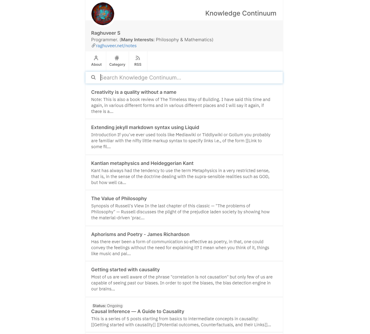
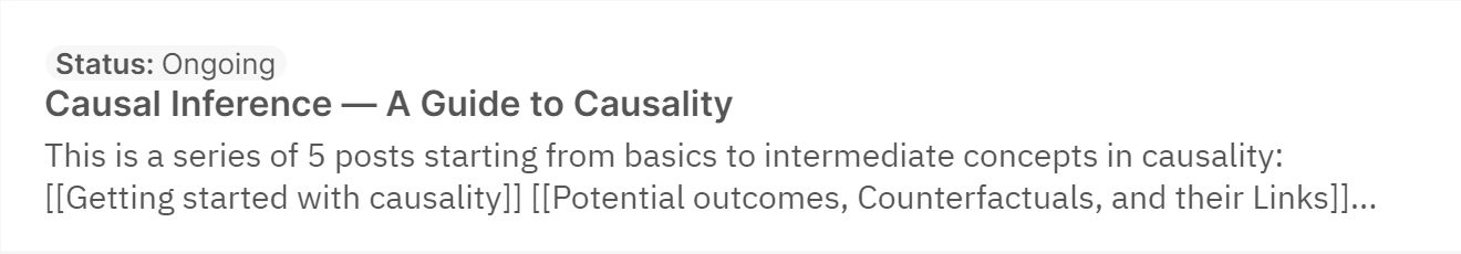
Auto-tagging WIP posts on the feed
Sometimes you are writing something interesting but have not completed the entire thing, lets say like a series of posts on single, it can be helpful to show users right away on the feed/homepage the status so that when they click the post, their expectations are already managed.
Here is a screenshot.
Clickable tags
If you go the posts on the homepage, and go inside any of them and try to click on the tags such as date or category, you will see that it takes you to a page with all the posts belonging to that tag or date. Just a nifty little feature.
And that is all! Thanks for scrolling all the way through to see all the features. Now if you'd like to know how to use this theme, head over to the post titled How to setup Enjoyment work. And if you would like to see how to use these features, head over to How to use Enjoyment work features on your website
P.S If you use VSCode like me for content creation and authoring, and are interested in autocompletion of titles when you write your notes. You can use a small VSCode plugin that I wrote for myself to ease up my writing process: Notecomplete
About Brennan Kenneth Brown
Hey there! My name is Brennan, I'm a 29-year-old Métis web developer and content strategist from Winnipeg, Manitoba and currently reside in Calgary, Alberta. I've recently compeleted a Full Stack Developer Program at EvolveU, and I'm looking to help those that need web development work done, or searching for ideas and management for their next content project.